What is Storybook
Storybook is a tool we use to develop, document, and test the UI of our app. Modern UIs are built using components, and Storybook promotes a Component-Driven Development approach. It helps us work on our components in an isolated environment, separated from the main app, to ensure their quality from every angle.
It is also the most suitable choice for documenting design systems. It serves as the perfect source of truth connecting the work of designers and developers.
From its roots as a niche tool, it has become an industry standard in the development of visual interfaces.
Fundamental changes in the new version
The storybooks within our apps are now much larger and more sophisticated than some years ago. That's why the Storybook team has focused their efforts on improving ergonomics for this new version. On three main aspects:
- A renovated interface design
- A more simple way to write stories
- A better support for Typescript
A renovated interface design
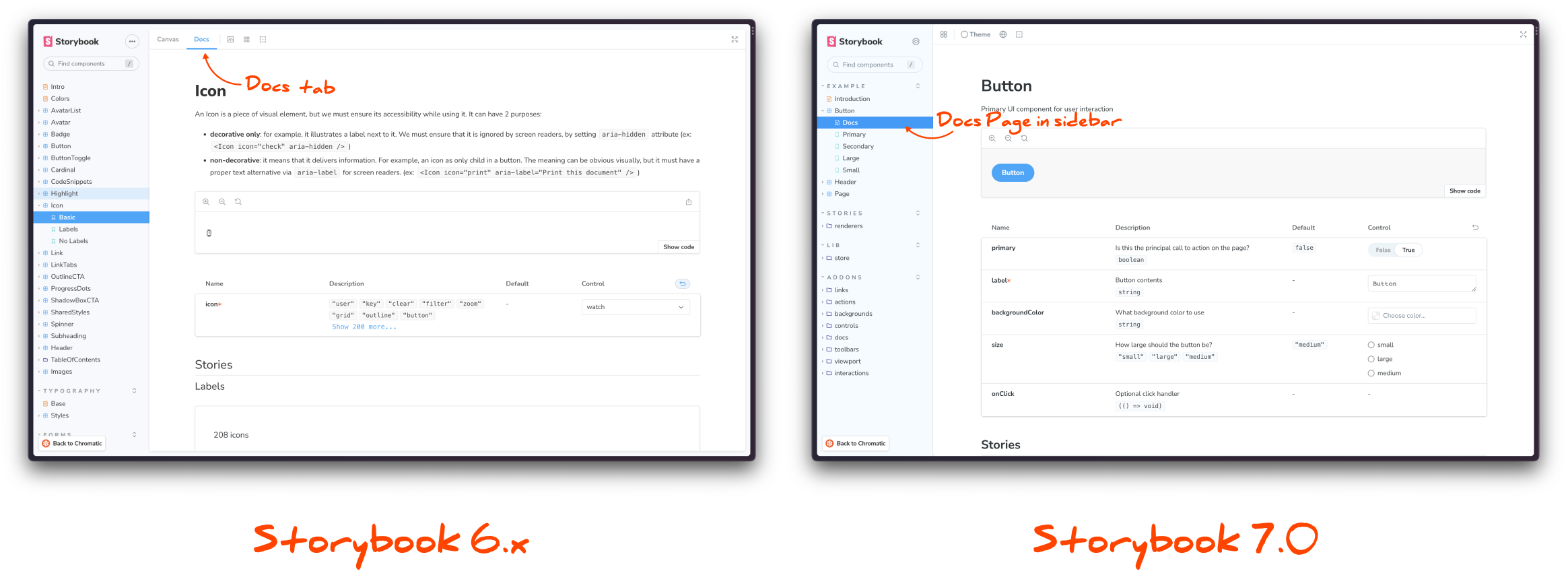
The interface has been the subject of a restyling. It includes a new icon set, the redesign and consolidation of floating menus, and lots of tweaks aimed at improving its general look and experience of use. Most significant change is the disappearance of the "Docs" tab from the story upper menu, relocated in the side menu. We will see this in more detail in the section of Documentation.
A more simple way to write stories
Storybook uses a format called Component Story Format (CSF) to write stories. With the new release of Storybook 7, we can now use CSF 3, which means we can write stories with much less code
In the new version of Storybook, the syntax of the story becomes a simple object, with no need for any additional declarations.
1// Storybook 6
2export default {
3  title: 'Components/Button',
4  component: Button,
5};
6
7export const Primary = (args) => <Button {...args} />;
8Primary.args = { primary: true };
9
10// Storybook 7
11export default { component: Button };
12export const Primary = { args: { primary: true } };
The default export (lines 2 and 11) is known as meta. It specifies the general characteristics of the component. The named export (lines 7 and 12) represents the story. It specifies the inputs needed to create a particular component state that we're interested in documenting.
With CFS 2, we had to include a render function for each one of our stories (line 7). With CSF 3 that is no longer necessary. The syntax of the story becomes a simple object, with no need for any additional declarations.
Nonetheless, stories accept a render property in case we want to override certain component behavior for a specific story. To do that:
1export const Primary = {
2 render: (args) => <Button {...args} specialProp={specialProp}/>
3 args: { primary: true }
4}
Now that stories are pure objects, we can extend them from a previous story using Javascript spread:
1export const Tertiary = {
2  ...Primary,
3  args: { primary: true },
4};
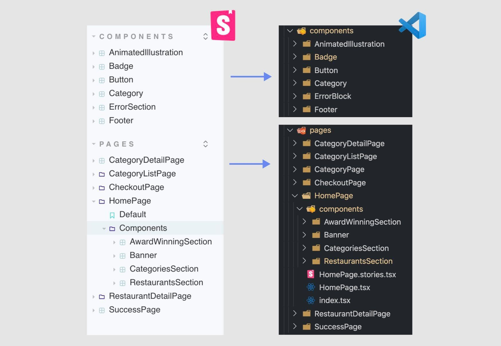
Another interesting novelty is that, from now on, we can spare the title attribute from the meta object. Typically, we've used title to indicate the title and the location of our story in the contents tree. We indicated title with a simple string ("Button"), and location with a path format ("Atoms/Button").
Storybook can now read the location and structure of our app files, just like we see it in our IDE. This means we no longer need to worry about organizing stories, and we'll have a much nicer consistent experience between our IDE and Storybook.

Source "Component Story Format 3 is here", Storybook blog
A better support for Typescript
Typing stories in Storybook had a common issue where it couldn't detect when we missed required properties in a component's story. This meant that the help we got from Typescript in Storybook was limited, not strongly typed.
We face this limitation because stories can get their arguments from both the meta object and the story itself. Here's an example:
1export type Props = {
2  planName: string;
3  price: number;
4  planDescription: string;
5};
6
7export default {
8  component: PlanCard,
9  title: 'General/PlanCard',
10  args: {
11    planName: 'Premium',
12  },
13} as Meta;
14
15const Template: Story<Props> = (args) => <PlanCard {...args} />;
16
17export const Default = Template.bind({});
18Default.args = {
19  // price is required, so we should have an error here
20  planDescription: 'Zero to conversational in a month.',
21};
If you would check, you'll see the property args in the Default story gets typed as Partial<Props>, which means we can't tell which properties are missing
The release of version 7, includes two new types, Meta and StoryObj, that will allow for auto-completion and error detection when a story doesn't meet the component's types. The easiest way to type a stories with these new types is:
1const meta: Meta<typeof Button> = {
2  component: Button,
3};
4export default Meta;
5
6type Story = StoryObj<typeof Button>;
7export const Primary: Story = { args: { primary: true } };
But to fix the issue we mentioned earlier, where args are shared between meta and stories, we need to type differently, to help Typescript understand. We can use the new satisfies operator in Typescript to our advantage.
1
2import { PlanCard } from ".";
3import { Meta, StoryObj } from "@storybook/react";
4
5const meta = {
6  component: PlanCard,
7  args: {
8    planName: "Premium"
9  }
10} satisfies Meta<typeof PlanCard>
11
12export default meta
13
14export const Default: StoryObj<typeof meta> = {
15  args: {
16    // now we have autocompletion and errors 🎉
17   planDescription: 'Zero to conversational in a month.',
18  }
19};
20

Autocompletion for stories at Storybook 7

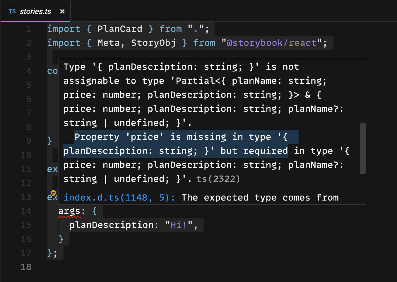
Type errores for stories at Storybook 7
As we see in the images above, now we do have autocompletion and error detection. The type of args is a much more complex union now, with planName noted as optional, because Typescript gets that we have already specified it at the meta level.
1// This is the types that Typescript is able to infer now 👏
2Partial<{
3    planName: string;
4    price: number;
5    planDescription: string;
6}> & {
7    price: number;
8    planDescription: string;
9    planName?: string | undefined;
10}
11
📎 You can inspect types in this CodeSandbox
Documentation in Storybook 7
As we mentioned earlier, in the new version of Storybook, the location of the Docs changes. They are no longer in the upper menu of each story but have been integrated into the contents tree, as the first story of each component. This change reflects the Storybook team intention to makes us, users, more aware of this resource.
Most of times, our components are self-descriptive but, on some situations, we want to provide more detailed documentation. For example, if we're working on a design system or when our Storybook will be used by various stakeholders, and we need to be more thorough. In cases like those, we have docs to our disposal.

Source "Storybook 7 Docs", Storybook blog
There are different options to document your components:
- Autodocs
- Custom documentation
Autodocs
The autodoc is a template automatically generated for each of our files. It includes examples and descriptions of the stories we create for the component. This feature is optional. If we want to generate autodocs, we need to be explicit about it. We do that by passing a prop to the meta object:
1const meta = {
2  component: Button,
3  tags: ['autodocs'],
4};
In case we want to go a step further, we can customize the autodocs. We can do that in two ways:
- By adding JSDoc comments, which will transform in the descriptions of our story inside the documentation.
- Using the options parameters.docs provide us with.
1/** This is the description of my story */
2export const Primary: Story = {
3  args: {
4    primary: true,
5  },
6  parameters: {
7    docs: {
8      canvas: { sourceState: 'shown' },
9    },
10  },
11};
Custom documentation
If what we want is complete control over documentation, we can use MDX. MDX is a combination of markdown and the ability to render components, and it's an industry-standard syntax that's not specific to Storybook. Storybook 7 uses MDX 2. With MDX we can create documentation pages that tied to a specific story or independent — if we want to introduce our system and provide general info.
📎 More on documentation at Storybook
Testing with Storybook 7
Storybook can be considered a testing tool in its own right. But it has also been incorporating more and more integrations that enable different types of testing, including unit and integration tests, directly within its framework. I can imagine this might be particularily useful for teams specialized in UI development, because it will allow them to focus all their testing efforts in one place within the application, and save them setting up and integrating multiple testing tools, which can often lead to overlaps and redundancies.
In order to create a component test, we do three steps:
- Isolate the component and set up a test case.
- Emulate interaction with tools like Testing Library.
- Make assertions with tools like Jest.
Often, we do tons of work just to render the components in an isolated manner in our tests (mocking providers, routers, data...), when we can leverage the work we've already done in our stories, which provide an isolated and visual way to render our components. Besides, our tests typically run in a Node environment, where we won't receive any visual feedback when something goes sideways.
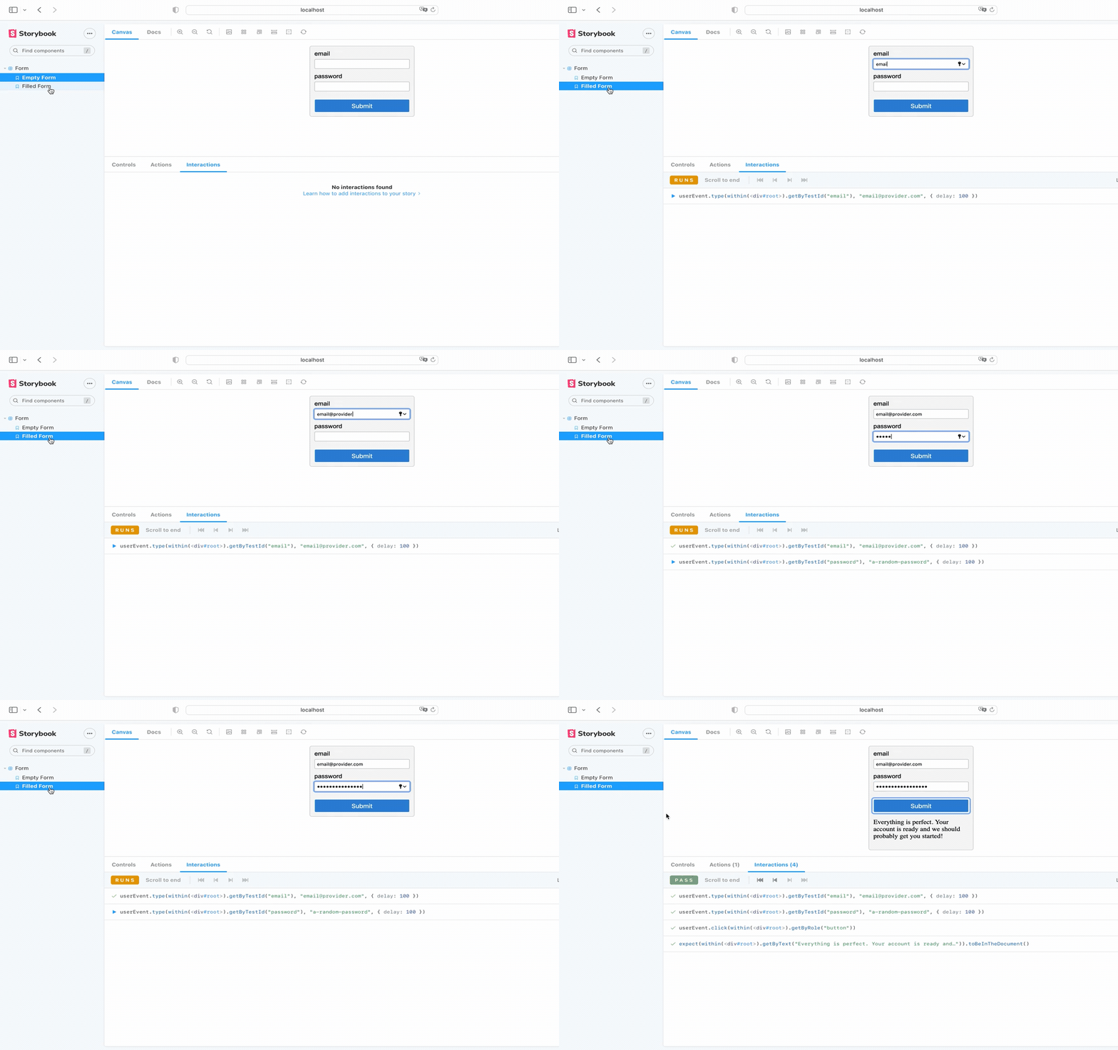
The idea with Storybook Interaction Tests is to write our tests directly inside the stories and execute them in the browser. Each one of the stories we create is a test case in itself, where first thing we do is render the component and check everything behaves they way we expect.
Then, we can use the new story property play and write the test directly in our story. In the test, we simulate user interaction in the browser and make assertions. Storybook provide us with wrappers for Jest and Testing Library, which makes possible their use in a browser-based environment.
1import { within, fireEvent } from '@storybook/testing-library';
2import { expect } from '@storybook/jest';
3
4export const Default = {
5  play: async ({ canvasElement }) => {
6    const canvas = within(canvasElement);
7
8    await fireEvent.click(canvas.getRoleBy('button'));
9
10    await expect(canvas.getByText('Are you sure?')).toBeInTheDocument();
11  },
12};
Adding tests with Jest and Testing Library is a way of augment the testing experience of writing stories.
To visualize the result of our tests, there's a new panel, Interactions, where we can run each interaction step and debug our tests.

Source "Component Story Format 3 is here", Storybook blog
For this to be a viable testing option, we need a way to integrate these tests into the continuous integration pipeline of our application. Storybook offers a test runner that transforms all the story-level interactions into tests that we can run in headless mode. This test runner also includes options for generating coverage reports. And, when a test fails, it prints a direct link to the Storybook story that is failing so we can quickly visualize the error address the issue.
While it works with Playwright behind the scenes, which kind of forces us to get familiar with a new tool and add it to our stack, looks like a option worthy of further exploration.
Storybook features a complete section of documentation about testing on their site.
So, when do we start?
Well, what about now? When I originally wrote the original article in Spanish, the stable version of Storybook was 6.5, and the team was polishing the finishing details before its release.
Now the latest version has been launched 🎉, and we can start benefiting from all its new features. If you have a codebase that you would like to update to the new version, Storybook has provided a guide to help you make the necessary changes.
This new version is packed with lots of good stuff, and just the time and code savings that the new story format will bring, makes me eager to start integrating it into my side projects and company's projects.